01 - 可视化面板示例

本文是根据 Pink 老师 B站的教程 ECharts数据可视化项目 和笔记所写,完成的个人数据可视化面板如下图所示:

数据可视化面板-ECharts

也可以点击右侧按钮直接查看 Butterfly

注意:上述提供的数据可视化面板例子在移动端并不适配。

02 - 使用技术

完成该项目需要具备以下知识:

  • div + css 布局;
  • flex 布局;
  • Less;
  • 原生js + jquery 使用;
  • rem适配;
  • echarts基础

03 - 案例适配方案

  • 设计稿是1920px ;
    1. flexible.js 把屏幕分为 24 等份;
    2. cssrem 插件的基准值是 80px;在 VS Code 中插件–> 配置按钮 –> 配置扩展设置 –> Root Font Size 里面设置,然后重启 VS Code 软件保证生效。

04 - 基础设置

  • body 设置背景图,缩放为 100%,行高1.15;
  • css初始化。
1
2
3
4
5
body {
// top center垂直居中靠上
background: url(https://cdn.jsdelivr.net/gh/Y-JINHAO/resources/img/echarts-bg.jpg) no-repeat top center;
line-height: 1.15;
}

05 - header 布局

  • 高度为 100px;

  • 背景图,在容器内显示;

  • 缩放比例为 100%;

  • h2 标题部分白色\28像素居中显示行高为 60像素;

  • 时间模块 showTime 定位右侧 right 为 40px 行高为 50px 文字颜色为:rgba(255, 255, 255, 0.7) 而文字大小为 16px;

    1
    2
    3
    4
    5
    6
    7
    8
    9
    10
    11
    12
    13
    14
    15
    16
    17
    18
    19
    20
    21
    22
    23
    24
    25
    26
    27
    28
    29
    30
    31
    32
    // 格式: 当前时间:2020年3月17-0时54分14秒
    <script>
    // 头部右侧时间
    // 格式:当前时间:2020年8月17-11时19分14秒
    var t = null
    t = setTimeout(time, 500) //開始运行
    function time() {
    clearTimeout(t) //清除定时器
    dt = new Date()
    var y = dt.getFullYear()
    var mt = dt.getMonth() + 1
    var day = dt.getDate()
    var h = dt.getHours() //获取时
    var m = dt.getMinutes() //获取分
    var s = dt.getSeconds() //获取秒
    document.querySelector('.showTime').innerHTML =
    '当前时间:' +
    y +
    '年' +
    mt +
    '月' +
    day +
    '日-' +
    h +
    '时' +
    m +
    '分' +
    s +
    '秒'
    t = setTimeout(time, 500) //设定定时器,循环运行
    }
    </script>
  • header部分css样式

1
2
3
4
5
6
7
8
9
10
11
12
13
14
15
16
17
18
19
20
21
22
23
24
25
// 头部样式
header {
position: relative;
height: 1rem;
background: url(https://cdn.jsdelivr.net/gh/Y-JINHAO/resources/img/echarts-head_bg.png) no-repeat;
// 缩放比例为 100%
background-size: 100% 100%;

h2 {
font-size: 0.35rem;
color: #fff;
text-align: center;
line-height: 0.75rem;
}

.showTime {
// 子元素绝对定位,父元素一定设置相对定位
position: absolute;
right: 0.5rem;
top: 0;
line-height: 0.625rem;
color: rgba(255, 255, 255, 0.7);
font-size: 0.2rem;
}
}

06 - mainBox主体模块

  • 需要一个上、左、右的 10px 的内边距;
  • column 列容器,分三列,占比 3:5:3。
1
2
3
4
5
6
7
8
9
10
11
12
13
14
15
16
17
18
19
20
21
22
23
24
25
26
27
// 页面主体盒子样式
.mainBox {
// 设定最小宽度,屏幕缩小到这里就不能再缩小了
min-width: 1024px;
max-width: 1920px;
margin: 0 auto;
padding: 0.125rem 0.125rem 0;
display: flex;

.column {
// 每个column占页面三份,父元素设定display:flex
flex: 3;
}

// 第二个column占页面 5
.column:nth-child(2) {
flex: 5;
// 给中间盒子加外边距 上为0 左右10px 底部15px
margin: 0 0.125rem 0.1875rem;
// 中间部分底部会出现滚动条 底下留白 因为选择的图片有时候会超出 所有设定超出部分隐藏
overflow: hidden;
}

/* &:nth-child(2) {
flex: 5;
} */
}

07 - 公共面板模块 panel

  • 高度为 310px;
  • 1像素的 1px solid rgba(25, 186, 139, 0.17) 边框;
  • 有line.jpg 背景图片;
  • padding为 上为 0 左右 15px 下为 40px;
  • 下外边距是 15px;
  • 利用panel 盒子 before 和after 制作上面两个角大小为 10px 线条为 2px solid #02a6b5;
  • 新加一个盒子 before 和 after 制作下侧两个角宽度高度为 10px。
1
2
3
4
5
6
7
8
9
10
11
12
13
14
15
16
17
18
19
20
21
22
23
24
25
26
27
28
29
30
31
32
33
34
35
36
37
38
39
40
41
42
43
44
45
46
47
48
49
50
51
52
53
54
55
56
57
58
59
60
61
62
.panel {
position: relative;
height: 3.875rem;
border: 1px solid rgba(25, 186, 139, 0.17);
// 用到了转义字符
background: url(https://cdn.jsdelivr.net/gh/Y-JINHAO/resources/img/echarts-line\(1\).png) rgba(25, 186, 139, 0.03);
padding: 0 0.1875rem 0.5rem;
margin-bottom: 0.1875rem;

// 有before、after 伪元素来设置盒子上面两边的角
&::before {
position: absolute;
top: 0;
left: 0;
content: '';
width: 10px;
height: 10px;
border-top: 2px solid #02a6b5;
border-left: 2px solid #02a6b5;
}

&::after {
position: absolute;
top: 0;
right: 0;
content: '';
width: 10px;
height: 10px;
border-top: 2px solid #02a6b5;
border-right: 2px solid #02a6b5;
}

// 底部设置一个盒子再用before、after 两个伪元素设置panel盒子底部两边的角
.panel-footer {
position: absolute;
left: 0;
bottom: 0;
width: 100%;

&::before {
position: absolute;
bottom: 0;
left: 0;
content: '';
width: 10px;
height: 10px;
border-bottom: 2px solid #02a6b5;
border-left: 2px solid #02a6b5;
}

&::after {
position: absolute;
right: 0;
bottom: 0;
content: '';
width: 10px;
height: 10px;
border-bottom: 2px solid #02a6b5;
border-right: 2px solid #02a6b5;
}
}
}

08 - 柱形图 bar 模块(布局)

  • 标题模块 h2,高度为 48px,文字颜色为白色,文字大小为 20px;
  • 图标内容模块 chart 高度为240px;
  • 以上可以作为 panel 公共样式部分。
1
2
3
4
5
6
7
8
9
10
11
12
13
14
15
16
17
18
19
20
21
22
23
 h2 {
height: 0.6rem;
line-height: 0.6rem;
color: rgb(253, 251, 251);
text-align: center;
font-size: 0.225rem;
font-weight: normal;

a {
color: rgb(162, 163, 163);
text-decoration: none;
margin: 0 0.125rem;
font-size: 0.2rem;
}
/* a:nth-child(1){
padding-left: 0.25rem;
} */
}

// 放图表的地方
.chart {
height: 3rem;
}

09 - 中间布局

  • 上面是 no 数字模块
  • 下面是 map 地图模块
  1. 数字模块 no 有个背景颜色 rgba(101, 132, 226, 0.1); 有个 15 像素的内边距;
  2. 注意中间列 column 有个左、右 10px 下 15px 的外边距;
  3. no 模块里面上下划分上面是数字(no-hd),下面是相关文字说明(no-bd);
  4. no-hd 数字模块有一个边框 1px solid rgba(25, 186, 139, 0.17) ;
  5. no-hd 数字模块里面分为两个小 li 每个小li高度为 60px,文字大小为 40px,颜色为 #ffeb7b,字体是图标字体 electronicFont;
  6. no-hd 利用 after 和 before制作2个小角,边框 2px solid #02a6b5 宽度为 30px 高度为 10px;
  7. 小竖线给第一个小 li after 就可以 1px宽 背景颜色为 rgba(255, 255, 255, 0.2); 高度 50%、top 25% 即可;
  8. no-bd 里面也有两个小 li ,高度为 40px,文字颜色为 rgba(255, 255, 255, 0.7),文字大小为 18px,上内边距为 10px。
1
2
3
4
5
6
/* 声明字体*/
@font-face {
font-family: electronicFont;
// font 文件夹下
src: url(../font/DS-DIGIT.TTF);
}

地图模块制作:

  1. 地图模块高度为 810px,里面包含4个盒子,chart 放图表模块球体盒子 旋转1、旋转2;
  2. 球体图片模块 map1 大小为 518px,要加背景图片,因为要缩放 100% 定位到最中央、透明度 0.3;
  3. 旋转1:map2。大小为 643px,要加背景图片,因为要缩放 100% 定位到中央、透明度 0.6,做旋转动画、利用z-index压住球体(html 中将 map2 写在 map1 后面就可以);
  4. 旋转2:map3。大小为 566px,要加背景图片,因为要缩放 100% 定位到中央、旋转动画、注意是逆时针。
1
2
3
4
5
6
7
8
9
10
11
12
13
14
15
16
17
18
19
20
21
22
<!-- no 数字模块制作 -->
<div class="no">
<div class="no-hd">
<ul>
<li>8454</li>
<li>970910</li>
</ul>
</div>
<div class="no-bd">
<ul>
<li>ZXF Tail Phone Number</li>
<li>Whales In The Blue Sea</li>
</ul>
</div>
<!-- map 地图模块 包括chart:放图表模块,球体盒子:map1,旋转1:map2,旋转2:map3 -->
<div class="map">
<div class="map1"></div>
<div class="map2"></div>
<div class="map3"></div>
<div class="chart"></div>
</div>
</div>

中间样式

1
2
3
4
5
6
7
8
9
10
11
12
13
14
15
16
17
18
19
20
21
22
23
24
25
26
27
28
29
30
31
32
33
34
35
36
37
38
39
40
41
42
43
44
45
46
47
48
49
50
51
52
53
54
55
56
57
58
59
60
61
62
63
64
65
66
67
68
69
70
71
72
73
74
75
76
77
78
79
80
81
82
83
84
85
86
87
88
89
90
91
92
93
94
95
96
97
98
99
100
101
102
103
104
105
106
107
108
109
110
111
112
113
114
115
116
117
118
119
120
121
122
123
124
125
126
127
128
129
130
131
132
133
134
135
136
137
138
139
140
141
142
143
144
145
146
147
148
149
150
151
152
153
154
155
156
157
158
// no 数字模块
.no {
background: rgba(101, 132, 226, 0.1);
padding: 0.1875rem;

.no-hd {
position: relative;
border: 1px solid rgba(25, 186, 139, 0.17);

// 用before、after 伪元素设置左上、右下的角
&::before {
position: absolute;
top: 0;
left: 0;
content: '';
// 固定宽、高,不用适配
width: 30px;
height: 10px;
border-top: 2px solid #02a6b5;
border-left: 2px solid #02a6b5;
}

&::after {
position: absolute;
bottom: 0;
right: 0;
content: '';
width: 30px;
height: 10px;
border-bottom: 2px solid #02a6b5;
border-right: 2px solid #02a6b5;
}

ul {
display: flex;

// 两个 li,每个占一份
li {
flex: 1;
line-height: 0.75rem;
font-size: 0.5rem;
color: #ffeb7b;
text-align: center;
// 设置图标字体,需要先声明(见开头CSS初始化内容)
font-family: electronicFont;
}

// 弄一个小竖线
li:nth-child(1)::after {
position: absolute;
top: 25%;
left: 50%;
content: '';
height: 50%;
width: 2px;
background: rgba(255, 255, 255, 0.2);
}
}
}

.no-bd {
ul {
display: flex;

li {
flex: 1;
height: 0.5rem;
line-height: 0.5rem;
color: rgba(255, 255, 255, 0.7);
font-size: 0.25rem;
padding-top: 0.125rem;
text-align: center;
font-family: electronicFont;
}
}
}
}

// 地图模块
.map {
position: relative;
height: 10.125rem;
margin-top: 0.2rem;

.map1 {
width: 6.475rem;
height: 6.475rem;
position: absolute;
// 为保证垂直居中,设定下面三个属性
top: 50%;
left: 50%;
transform: translate(-50%, -50%);
background: url(https://cdn.jsdelivr.net/gh/Y-JINHAO/resources/img/echarts-map.png) no-repeat top center;
// 图片随着窗口等比例缩放
background-size: 100% 100%;
opacity: 0.3;
}

.map2 {
width: 8.0375rem;
height: 8.0375rem;
position: absolute;
top: 50%;
left: 50%;
transform: translate(-50%, -50%);
background: url(https://cdn.jsdelivr.net/gh/Y-JINHAO/resources/img/echarts-lbx.png);
background-size: 100% 100%;
opacity: 0.6;
// 调用 rotate1动画 用时 10秒 匀速linear 无限循环infinite
animation: rotate1 10s linear infinite;
}

.map3 {
width: 7.075rem;
height: 7.075rem;
position: absolute;
top: 50%;
left: 50%;
transform: translate(-50%, -50%);
background: url(https://cdn.jsdelivr.net/gh/Y-JINHAO/resources/img/echarts-jt.png);
background-size: 100% 100%;
animation: rotate2 15s linear infinite;
}

.chart {
position: absolute;
top: 0;
left: 0;
width: 100%;
// 高度与父元素 map一致
height: 10.125rem;
}

// 旋转动画
@keyframes rotate1 {

// 从 0度旋转到 360度, 旋转时要保留圆形的位置,设置transform
from {
transform: translate(-50%, -50%) rotate(0deg);
}

to {
transform: translate(-50%, -50%) rotate(360deg);
}
}

@keyframes rotate2 {

// 从 0度旋转到 -360度, 就负时针旋转了
from {
transform: translate(-50%, -50%) rotate(0deg);
}

to {
transform: translate(-50%, -50%) rotate(-360deg);
}
}
}

10 - Echarts-介绍

常见的数据可视化库:

  • D3.js。目前 Web 端评价最高的 Javascript 可视化工具库(入手难) ;
  • ECharts.js。百度出品的一个开源 Javascript 数据可视化库;
  • Highcharts.js。国外的前端数据可视化库,非商用免费,被许多国外大公司所使用;
  • AntV。蚂蚁金服全新一代数据可视化解决方案等等;
  • Highcharts 和 Echarts 就像是 Office 和 WPS 的关系。

ECharts,一个使用 JavaScript 实现的开源可视化库,可以流畅的运行在 PC 和移动设备上,兼容当前绝大部分浏览器(IE8/9/10/11,Chrome,Firefox,Safari等),底层依赖矢量图形库 ZRender,提供直观,交互丰富,可高度个性化定制的数据可视化图表。

大白话:

官网地址:https://echarts.apache.org/zh/index.html

11 - Echarts-体验

官方教程:
[五分钟上手ECharts](https://www.echartsjs.com/zh/tutorial.html#5 分钟上手 ECharts)

使用步骤:
① 引入echarts 插件文件到html页面中;
② 准备一个具备大小的DOM容器;

1
<div id="main" style="width: 600px;height:400px;"></div>

③ 初始化echarts实例对象;

1
var myChart = echarts.init(document.getElementById('main'));

④ 指定配置项和数据(option);

1
2
3
4
5
6
7
8
9
10
11
12
13
var option = {
xAxis: {
type: 'category',
data: ['Mon', 'Tue', 'Wed', 'Thu', 'Fri', 'Sat', 'Sun']
},
yAxis: {
type: 'value'
},
series: [{
data: [820, 932, 901, 934, 1290, 1330, 1320],
type: 'line'
}]
};

⑤ 将配置项设置给echarts实例对象。

1
myChart.setOption(option);

12 - Echarts-基础配置

需要了解的主要配置:series xAxis yAxis grid tooltip title legend color

  • series

    • 系列列表。每个系列通过 type 决定自己的图表类型
    • 大白话:图标数据,指定什么类型的图标,可以多个图表重叠。
  • xAxis:直角坐标系 grid 中的 x 轴

  • boundaryGap: 坐标轴两边留白策略 true,这时候刻度只是作为分隔线,标签和数据点都会在两个刻度之间的带(band)中间。

  • yAxis:直角坐标系 grid 中的 y 轴

  • grid:直角坐标系内绘图网格。

  • title:标题组件

  • tooltip:提示框组件

  • legend:图例组件

  • color:调色盘颜色列表

    数据堆叠,同个类目轴上系列配置相同的 stack 值后 后一个系列的值会在前一个系列的值上相加。

1
2
3
4
5
6
7
8
9
10
11
12
13
14
15
16
17
18
19
20
21
22
23
24
25
26
27
28
29
30
31
32
33
34
35
36
37
38
39
40
41
42
43
44
45
46
47
48
49
50
51
52
53
54
55
56
57
58
59
60
61
62
63
64
65
66
67
68
69
70
71
72
73
74
75
76
77
78
79
80
81
82
83
84
85
86
87
88
89
90
91
92
93
94
95
96
97
98
99
100
101
102
103
104
105
106
107
108
109
110
111
112
113
114
115
116
117
118
119
120
121
122
123
124
125
126
127
128
129
130
131
132
133
134
135
136
137
138
139
140
141
142
143
144
poemData = [{
poemStructure: '词·上阕', //指定词的上下阕
radar: {
indicator: [{
text: '今古空名'
},
{
text: '但远山长'
},
{
text: '云山乱'
},
{
text: '晓山青'
},
{
text: '君臣一梦'
}
],
center: ['50%', '50%'],
radius: 60,
startAngle: 90,
splitNumber: 4,
shape: 'circle',
name: {
formatter: '【{value}】',
textStyle: {
color: '#72ACD1'
}
},
splitArea: {
areaStyle: {
color: ['rgba(114, 172, 209, 0.2)',
'rgba(114, 172, 209, 0.4)', 'rgba(114, 172, 209, 0.6)',
'rgba(114, 172, 209, 0.8)', 'rgba(114, 172, 209, 1)'
],
shadowColor: 'rgba(0, 0, 0, 0.3)',
shadowBlur: 5
}
},
axisLine: {
lineStyle: {
color: 'rgba(255, 255, 255, 0.5)'
}
},
splitLine: {
lineStyle: {
color: 'rgba(255, 255, 255, 0.5)'
}
}
},
series: {
name: '雷达图',
type: 'radar',
emphasis: {
lineStyle: {
width: 4
}
},
data: [{
value: [100, 8, 0.40, -80, 2000],
name: '图一',
symbol: 'rect',
symbolSize: 5,
lineStyle: {
type: 'dashed'
}
},
{
value: [60, 5, 0.30, -100, 1500],
name: '图二',
areaStyle: {
color: 'rgba(255, 255, 255, 0.5)'
}
}
]
}
},
{
poemStructure: '词·下阕',
radar: {
indicator: [{
text: '鱼翻藻鉴',
max: 150
},
{
text: '过沙溪急',
max: 150
},
{
text: '霜溪冷',
max: 150
},
{
text: '月溪明',
max: 120
},
{
text: '水天清',
max: 108
},
{
text: '鹭点烟汀',
max: 72
}
],
center: ['50%', '50%'],
radius: 60
},
series: {
name: '诗情',
type: 'radar',
radarIndex: 1,
data: [{
value: [120, 118, 130, 100, 99, 70],
name: '杜甫',
label: {
show: true,
formatter: function (params) {
return params.value;
}
}
},
{
value: [90, 113, 140, 30, 70, 60],
name: '李白',
areaStyle: {
opacity: 0.9,
color: new echarts.graphic.RadialGradient(0.5, 0.5, 1, [{
color: '#B8D3E4',
offset: 0
},
{
color: '#72ACD1',
offset: 1
}
])
}
}
]
}
}
];
};

13 - 柱状图图表

1
2
3
4
5
6
7
8
9
10
11
12
13
14
15
16
17
18
19
20
21
22
23
24
25
26
27
28
29
30
31
32
33
34
35
36
37
38
39
40
41
42
43
44
45
46
47
48
49
50
51
52
53
54
55
56
57
58
59
60
61
62
63
64
65
66
67
68
69
70
71
72
73
74
75
76
77
78
79
80
81
82
83
84
85
86
87
88
89
90
91
92
93
94
95
96
97
98
99
100
101
102
103
104
105
106
107
108
109
110
111
112
113
114
115
116
117
118
119
120
121
122
123
124
125
126
127
128
129
130
131
132
133
134
135
136
137
138
139
140
141
142
143
144
145
// 柱状图模块1
(function () {
// 1、实例化对象
var myChart = echarts.init(document.querySelector('.bar1 .chart'));

// 2、制定配置项和数据
var option = {
color: ['#457B9D', '#8D99AE'],
title: {
// text: '贞观四年长安降水量和蒸发量',
subtext: '纯属虚构'
},
tooltip: {
trigger: 'axis'
},
legend: {
// 修改图例组件文字的颜色
textStyle: {
color: '#8D99AE'
},
right: '40%',
data: ['降水量', '蒸发量']
},
toolbox: {
show: true,
feature: {
dataView: {
show: true,
readOnly: false
},
magicType: {
show: true,
type: ['line', 'bar']
},
restore: {
show: true
},
saveAsImage: {
show: true
}
},
// 修改工具箱组件的图标样式
iconStyle: {
color: '#B5838D'
}
},
calculable: true,
grid: {
left: '8%',
right: '5%',
bottom: '10%',
// containLabel: true
},
xAxis: [{
// 修改刻度标签相关样式 颜色、大小、是否加粗等
axisLabel: {
color: 'rgba(255,255,255,0.6)'
},
// 去除刻度线
axisTick: {
show: false
},
// X轴样式不显示 去除轴线
axisLine: {
show: false
},
type: 'category',
data: ['1月', '2月', '3月', '4月', '5月', '6月', '7月', '8月', '9月', '10月', '11月', '12月']
}],
yAxis: [{
axisLabel: {
color: 'rgba(255,255,255,0.6)'
},
axisLine: {
show: false
},
type: 'value',
// Y轴分割线样式
splitLine: {
lineStyle: {
color: 'rgba(255,255,255,0.1)',
width: 1
}
}
}],
series: [{
name: '降水量',
type: 'bar',
data: [2.6, 5.9, 9.0, 26.4, 28.7, 70.7, 175.6, 182.2, 48.7, 18.8, 6.0, 2.3],
markPoint: {
data: [{
name: '年最高',
value: 182.2,
xAxis: 7,
yAxis: 183
},
{
name: '年最低',
value: 2.3,
xAxis: 11,
yAxis: 3
}
]
},
markLine: {
data: [{
type: 'average',
name: '平均值'
}]
}
},
{
name: '蒸发量',
type: 'bar',
data: [2.0, 4.9, 7.0, 23.2, 25.6, 76.7, 135.6, 162.2, 32.6, 20.0, 6.4, 3.3],
markPoint: {
data: [{
type: 'max',
name: '最大值'
},
{
type: 'min',
name: '最小值'
}
]
},
markLine: {
data: [{
type: 'average',
name: '平均值'
}]
}
}
]
};

// 3、把配置项设置给 echarts实例对象
myChart.setOption(option);

// 4、让图标跟随品目自动的去适应
// 监听屏幕的变化,并调用函数缩放
window.addEventListener('resize', function () {
myChart.resize();
});
})();
  • 让图表跟随屏幕自适应
1
2
3
window.addEventListener("resize", function() {
myChart.resize();
});

14 - 饼图模块

1
2
3
4
5
6
7
8
9
10
11
12
13
14
15
16
17
18
19
20
21
22
23
24
25
26
27
28
29
30
31
32
33
34
35
36
37
38
39
40
41
42
43
44
45
46
47
48
49
50
51
52
53
54
55
56
57
58
59
60
61
62
63
64
65
66
67
68
69
70
71
72
73
74
75
76
77
78
79
80
81
82
83
84
85
86
87
88
89
90
91
92
93
94
95
96
97
98
99
100
101
102
103
104
105
106
107
108
109
110
111
112
113
114
115
116
117
118
119
120
121
122
123
124
125
126
127
128
129
130
131
132
133
134
135
136
137
138
139
// 饼图模块
(function () {
var myChart = echarts.init(document.querySelector('.pie .chart'));
var option = {
color: ['#E63946', '#F1FAEE', '#A8DADC', '#457B9D', '#B5838D', '#F4A261', '#F3FFBD', '#247BA0'],
title: {
// text: '南丁格尔玫瑰图',
subtext: '纯属虚构',
bottom: 'right'
},
tooltip: {
trigger: 'item',
formatter: '{a} <br/>{b} : {c} ({d}%)'
},
toolbox: {
show: true,
feature: {
mark: {
show: true
},
dataView: {
show: true,
readOnly: false
},
magicType: {
show: true,
type: ['pie', 'funnel']
},
restore: {
show: true
},
saveAsImage: {
show: true
},
},
// 修改工具箱组件的颜色
iconStyle: {
// 线性渐变,前四个参数分别是 x0, y0, x2, y2, 范围从 0 - 1,相当于在图形包围盒中的百分比,如果 globalCoord 为 `true`,则该四个值是绝对的像素位置
color: '#8D99AE'
}
},
series: [
/* {
name: '半径模式',
type: 'pie',
radius: [20, 110],
center: ['25%', '50%'],
roseType: 'radius',
label: {
show: false
},
emphasis: {
label: {
show: true
}
},
data: [{
value: 10,
name: 'rose1'
},
{
value: 5,
name: 'rose2'
},
{
value: 15,
name: 'rose3'
},
{
value: 25,
name: 'rose4'
},
{
value: 20,
name: 'rose5'
},
{
value: 35,
name: 'rose6'
},
{
value: 30,
name: 'rose7'
},
{
value: 40,
name: 'rose8'
}
]
}, */
{
name: '面积模式',
type: 'pie',
// 带有直角坐标系的比如折线图柱状图是 grid修改图形大小,而饼形图是通过 radius 修改大小
// radius第一个值是内圆的半径,第二个值是外圆的半径
radius: [10, 70],
center: ['50%', '50%'],
roseType: 'area',
data: [{
value: 10,
name: 'rose1'
},
{
value: 5,
name: 'rose2'
},
{
value: 15,
name: 'rose3'
},
{
value: 25,
name: 'rose4'
},
{
value: 20,
name: 'rose5'
},
{
value: 35,
name: 'rose6'
},
{
value: 30,
name: 'rose7'
},
{
value: 40,
name: 'rose8'
}
]
}
]
};
myChart.setOption(option);
window.addEventListener('resize', function () {
myChart.resize();
})
})();

15 - 其他模块

可以自行选择一些类型的 Echarts 图尝试。

16 - Echarts-社区介绍

社区是社区贡献者维护的Apache ECharts (incubating)相关作品,与官方的 Apache ECharts (incubating) 项目无关。

1576664444951

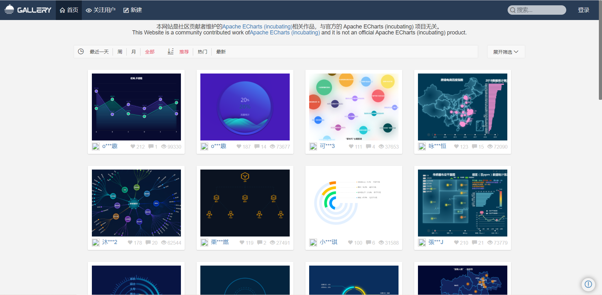
  • 在这里可以找到一些基于echart的高度定制好的图表,相当于基于jquery开发的插件,这里是基于echarts开发的第三方的图表。

17 - Echarts-map使用(扩展)

参考社区的例子:https://gallery.echartsjs.com/editor.html?c=x0-ExSkZDM (模拟飞机航线)

实现步骤:

  • 第一需要下载china.js提供中国地图的js文件;
  • 第二个因为里面代码比较多,我们新建一个新的js文件 myMap.js 引入;
  • 使用社区提供的配置即可。

需要修改:

  • 去掉标题组件;
  • 去掉背景颜色;
  • 修改地图省份背景 #142957 areaColor 里面做修改;
  • 地图放大通过 zoom 设置为 1.2 即可。
1
2
3
4
5
6
7
8
9
10
11
12
13
14
15
16
17
18
19
geo: {
map: 'china',
zoom: 1.2,
label: {
emphasis: {
show: false
}
},
roam: false,
itemStyle: {
normal: {
areaColor: '#142957',
borderColor: '#0692a4'
},
emphasis: {
areaColor: '#0b1c2d'
}
}
},

18 - 最后约束缩放

1
2
3
4
5
6
7
8
9
10
11
/* 约束屏幕尺寸 */
@media screen and (max-width: 1024px) {
html {
font-size: 42px !important;
}
}
@media screen and (min-width: 1920px) {
html {
font-size: 80px !important;
}
}